New teaching spaces in the Central Courtyard are both exciting and puzzling at the same time. Some rooms have a focal point (a screen with a projector), while others do not. Some have screens around the room and others have whiteboards. Some rooms are laid-out to imitate a ‘lounge’ and an ‘office’ environment.
This article will (hopefully) help you pick the most suitable space for you.
Consideration 1: Do you need a big screen (focal point?)

It is common in teaching to have a focal point, e.g., a large screen in the middle of the room. Think a ‘typical’ set up in most ‘traditional’ rooms = Lecturn with 1 or 2 large screens behind.
This set-up is especially suitable for presenting (e.g., lecture-style sessions; student presentations), and most 1CC rooms do include large screens and projectors. Note, however, that by default the screen might be hidden, and you might need to open them up via AV controls.
However, 4 out of 24 rooms (103/105/116/214) are not equipped with large retractable screens and projectors. Instead, they have smaller digital screens around the room that students can display their work on.
Therefore, if needed, the same content could be projected on these small screens and students can view it within their table. However, the real value of these 4 rooms is in their capacity to project different work (e.g., students can showcase their individual or groupwork to peers). In other words, these 4 rooms will be a good match for those looking to do project-based classes, or other sessions where students will benefit from projecting different artifacts on digital screens.
Key take-away:
If having a focal point is important for your teaching, avoid rooms 103/105/116/214. These 4 rooms are more suitable for project-based classes or sessions where students can project different artifacts on screens.
| Rooms with data projector (large screen/s) | Rooms WITHOUT data projector(s) |
| 101/104/ 106/ 107/ 109/ 111/ 112/ 114/ 115/ 201/ 203/ 204/ 205/ 207/ 208/ 210/ 215/ 216/ 217/ 218 | 103/ 105/ 116/ 214 Note: these rooms have digital screens around the room. |
Consideration 2: Ambiance fit?

Most rooms are neutral and look and feel like a modern classroom. But if your teaching could benefit from recreating a more ‘office’ feel (might be suitable for work-integrated learning), you might want to check out Room 203. This room is designed to recreate an ‘office’ feeling with some workstations, meeting rooms and lounges.
Similarly, Room 217 aims to simulate a ‘café’ or a ‘lounge’ ambiance, which might add value in more informal or conversation-based units where recreating a less formal environment might contribute to open and in-depth conversations.
Consideration 3: Do you love using whiteboards?

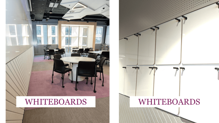
If you regularly get students to write on butcher’s paper or you’d like to make student note-taking visible to others, consider rooms with Huddle Boards (101/109, 201,210 ). These rooms have a unique feature of a large white board consisting of small ‘movable’ whiteboards. These small whiteboards can be taken out and put back in. The intention is allow students to take notes/work from any location in the room and display their work once they’ve finished.
Alternatively, you might appreciate rooms 106 , 107 , 111,114,115, 204, 208, 215, 216, where the whiteboards are continuous along front and back walls, so lots of ‘whiteboard real-estate’ to take advantage of!
Consideration 4: Do you plan active learning activities?
Rooms in Central Courtyard building were designed for ‘student participation’ rather than ‘student listening’.
These spaces aim to support students working in groups, moving around, writing on the whiteboards, switching stations, etc. In other words, these rooms, especially the 90-person rooms are not the best choice for ‘traditional’ didactic lectures where teachers are doing most of the talking and students mostly listen.
Want more?
Check out FAQ’s about 1CC teaching spaces

Share this: